
Pantone of the year 2000 - 2010
- Nov 17, 2023
- 3 min read
Updated: Feb 8, 2024
It's nearly the end of 2023, and one of the highlights that everyone eagerly anticipates each year is the announcement of the PANTONE Color of the Year. PANTONE is well-known for its Pantone Matching System (PMS), a color standardization system widely used in graphic design, fashion design, product design, printing, and manufacturing industries. As we approach the reveal of the 2024 Color of the Year, let's take a trip down memory lane and revisit the Colors of the Year from 2000 - 2010 onwards.
2000 : Cerulean 15-4020


Pantone of the year 2000, Powdery cerulean was chosen to represent the new millennium as the image of tranquility and calm. Pantone released a statement about this Color of the Year because it was the very first one. They chose blue due to how it’s the most accepted color by everyone, regardless of race, gender or nationality. The way in which blue is used in consumer products all over the world and for all audiences was the reason why it was chosen as the first ever Color of the Year.
2001 : Fuchsia Rose 17-2031


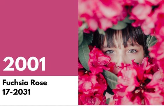
Pantone of the year 2001, An intense and passionate color, Fuchsia Rose took a turn in a different direction from the previous year.
2002 : True Red 19-1664


Pantone of the year 2002, True Red was chosen as a patriotic remembrance of the events that took place on 9/11. True Red was a strong and powerful hue that represented the fallen and the courageous on that fateful day.
2003 : Aqua Sky 14-4811


Pantone of the year 2003, A soft and calm tone meant to inspire a new hope and a sense of serenity.
2004


Pantone of the year 2004, Tigerlily, was a strong mix of red and yellow meant to inspire bold creativity. Inspired by the flower of the same name, it was a demonstration of how design is inspired by nature.
2005 : Blue Turquoise 15-5217


Pantone of the year 2005, Following along from the previous year’s inspiration from nature, the 2005 Color of the Year was Blue Turquoise. This is the color of the ocean on a calm, sunny day. Blue Turquoise is different from true turquoise in that it contains less green, making it a cooler tone.
2006 : Sand Dollar 13-1106


Pantone of the year 2006, The Color of the Year took on a neutral tone with Sand Dollar. It was chosen to represent concerns about the economic troubles going on at the time. This neutral color was very popular in fashion and interior decorate, reminiscent of the desert and sandy beaches.
2007 : Chili Pepper 19-1557


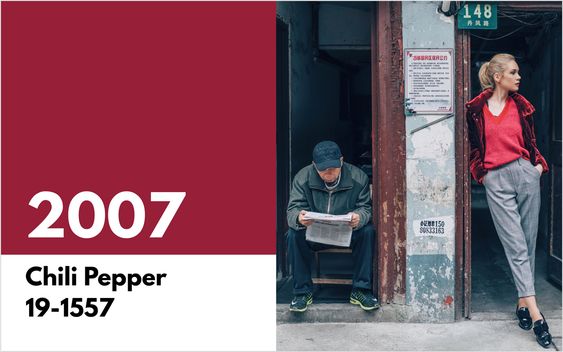
Pantone of the year 2007, Pantone Color of the Year was the first one that was announced with a press release about the inspiration behind it. Chilli Pepper was the color of fiery passion and the spirit of adventure.
2008 : Blue Iris 18-3943


Pantone of the year 2008, Blue Iris was the chosen Color of the Year for its mixed blue and purple qualities that inspired a meditative state. It combined well with deep plums and red browns for interior home decoration.
2009 : Mimosa 14-0848


Pantone of the Year 2009, Mimosa was named after the mimosa flower and the champagne and orange juice beverage. Mimosa was perceived as a dynamic and energetic color that inspired innovation in a time of economic uncertainty.
2010 : Tuquoise 15-5519


Pantone of the Year 2010, Turquoise was the color of tranquil tropical paradise and powerful, protective talismans. Turquoise was an important color due to how it was accepted positively by both men and women. The color was a perfect match for accessories and combined well with earthy tones.
source : Visme
For more information :
Facebook : Lavaredo Home & Kitchen
Line : @Lavaredo-kitchen (มี@)
Instagram : Lavaredo_kitchen

Comments